


HomeBlog

The Complete Guide to Mobile Website Optimization

Lindsie Nelson
VP and Head of SEO
In this article
Enjoying the article?
We’d love to help you apply these ideas to your own marketing. Schedule a free session with one of our strategists and walk away with 2–3 actionable takeaways.

Key takeaways

  • Mobile optimization means adjusting your site so it loads quickly and works correctly on smartphones and tablets.
  • Google uses mobile-first indexing, so the mobile version of your site determines how the whole site ranks.
  • Optimizing only a few pages leaves visitors on templates that break on small screens, so apply changes site-wide.
  • Core Web Vitals set the performance targets: LCP under 2.5 seconds, CLS below 0.1, and INP under 200 milliseconds.
  • Faster load times and simpler forms lift mobile conversions by removing friction before the visitor abandons the page.

Mobile optimization means adjusting your site so it loads fast and works correctly on phones and tablets. It matters for two reasons. Google indexes the mobile version of your site, and visitors who land on a slow page leave for a competitor. This guide covers the fundamentals, the Core Web Vitals targets, and the tools to track progress.

Related Content: SEO for AI Search    SERP Volatility and SEO     SEO Forecasting Guide

What Is Mobile Optimization?

Mobile optimization means updating your site so it functions smoothly on smartphones and tablets. This is not an optional refinement, since search engines evaluate your mobile pages first. Optimization may involve:

  • Reducing page load times on mobile
  • Making navigation simple for touch screens
  • Creating responsive designs that automatically adjust layout and content

Why Is Mobile Optimization Important?

Google uses mobile-first indexing, so your mobile version determines how the whole site is ranked. If pages take too long to load or the layout breaks on smaller screens, visitors leave and conversions drop. Poor experiences can also hurt your reputation when customers share feedback online. Investing in mobile optimization strengthens brand perception, improves SEO, and increases customer satisfaction.

Mobile Optimization Best Practices

A strong mobile optimization strategy focuses on usability and consistency across every page of your website.

Ensure text and icons display correctly

One of the biggest challenges of your mobile optimization strategy is ensuring everything displays correctly on your mobile website. You'll want to make sure icons and text are the right sizes on your mobile site to improve readability and accessibility. Testing your website on different devices will ensure you achieve this goal.

Optimize your entire website

Some businesses only optimize a few website pages for mobile devices. That might mean other pages don't display correctly on smartphones and tablets. Don't make this mistake! A proper optimization strategy means making changes to every single page on your desktop site so customers have a better mobile experience.  

Decrease page loading times

Customers might leave your website if it takes too long to load. That's why you should improve page loading times by caching web pages, optimizing rendering orders, and completing other tasks. Increasing page speeds will mean customers will stay on your website for longer and visit your site again in the future.

Improve product browsing

There are various ways to make it easier for customers to browse product pages on mobile devices. These methods include creating page gestures and ensuring add-to-cart buttons are "above the fold" — at the top of product pages before users scroll down. You should also make sure text displays correctly on smaller mobile screens, which improves functionality.

Create responsive designs

Responsive design is one of the most important parts of mobile optimization. It means designing your mobile website pages to respond to user behavior on smartphones and tablets. This process might involve using CSS and HTML features to improve the functionality of pages and provide visitors with a better user experience.

How to Optimize for Mobile Conversions

A mobile-friendly site improves conversions by removing friction. Faster load times and intuitive design make it easier for users to explore products and complete purchases. Shorter forms, clear progress bars, and simplified navigation encourage more sign-ups and sales. As content homogenization makes competing pages read alike, site experience becomes one of the few remaining differentiators. 

Core Web Vitals: What to Monitor
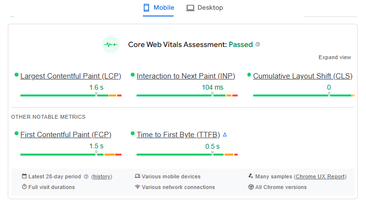
Core Web Vitals are Google's metrics for measuring real-world user experience. These indicators show how fast your content loads, how stable it feels while loading, and how quickly it reacts to user input.

Core Web Vital What it measures Good score
Largest Contentful Paint (LCP) How quickly the main content, like a hero image or headline, becomes visible Under 2.5 seconds
Cumulative Layout Shift (CLS) How much the layout shifts while loading. Images or ads that push text down frustrate users Below 0.1
Interaction to Next Paint (INP) How quickly the page responds to taps, clicks, or keypresses Under 200 milliseconds

Improving these scores requires a mix of technical and visual fixes—compressing images, preloading key files, deferring non-critical scripts, and reserving fixed space for media elements. Together, these steps create a smoother, faster experience that keeps users engaged and signals strong performance to search engines.

Check and Measure Performance

Use these free tools to test and monitor your progress:

  • PageSpeed Insights for LCP, CLS, and INP scores
  • Google Search Console to compare mobile vs desktop CTR and impressions
  • GA4 to track bounce and conversion rates by device

Review these monthly to see where you can continue to improve.

Partner With a Mobile Optimization Expert

Mobile optimization blends design, development, and SEO. A digital marketing agency experienced in responsive design, Core Web Vitals, HTML, and CSS can identify technical barriers and fix them efficiently. Partnering with experts like Symphonic Digital helps ensure your mobile site is fast, usable, and ready to rank higher.

Mobile Optimization FAQs

How do you make a website mobile friendly?

Start with responsive design so layouts adjust to any screen size. Then compress images, reduce render-blocking scripts, and enlarge tap targets and text for touch. Apply the changes to every template, not a handful of pages. Test on real devices and confirm Core Web Vitals pass.

What tools should I use to monitor mobile performance?

PageSpeed Insights reports Core Web Vitals from real user data. Google Search Console compares mobile and desktop clicks and impressions. GA4 shows conversion rate by device. Review all three monthly, and retest after any design or tracking change.

How do I check if my website is mobile friendly?

Run the page through PageSpeed Insights, which reports mobile Core Web Vitals from real user data. Use the Search Console performance report to compare mobile and desktop clicks and impressions, and GA4 to compare conversion rate by device. Google retired its standalone Mobile-Friendly Test tool, so these three are the current path.

What Core Web Vitals scores should a mobile site hit?

Aim for Largest Contentful Paint under 2.5 seconds, Cumulative Layout Shift below 0.1, and Interaction to Next Paint under 200 milliseconds. Google assesses these at the 75th percentile of real user visits, so passing a lab test is not the same as passing in the field.

How does mobile optimization affect SEO?

Mobile-first indexing means Google evaluates your mobile pages, so anything slow or missing on mobile affects rankings across all devices. Page experience signals also feed the quality assessments that determine which pages are eligible to be cited as sources in AI Overviews.

Is mobile optimization a one-time project?

No. New pages, new templates, and third-party scripts can each reintroduce slow loading or layout shift. Review Core Web Vitals monthly and retest after any design or tracking change. Treating mobile performance as ongoing maintenance is what keeps the gains from eroding.

Lindsie Nelson
VP and Head of SEO

Lindsie is VP and Head of SEO at Symphonic Digital, with over a decade of experience leading high-impact search strategies for B2B and B2C brands. She’s known for transforming complex SEO challenges into clear, results-driven strategies that boost visibility and drive long-term growth.

Linkedin
Enjoying the article?

We’d love to help you apply these ideas to your own marketing. Schedule a free session with one of our strategists and walk away with 2–3 actionable takeaways.

<script type="application/ld+json">

{

  "@context": "https://schema.org",

  "@graph": [

    {

      "@type": "BlogPosting",

      "@id": "https://www.symphonicdigital.com/blog/how-to-implement-a-mobile-optimization-strategy#article",

      "isPartOf": { "@id": "https://www.symphonicdigital.com/blog/how-to-implement-a-mobile-optimization-strategy#webpage" },

      "mainEntityOfPage": { "@id": "https://www.symphonicdigital.com/blog/how-to-implement-a-mobile-optimization-strategy#webpage" },

      "headline": "The Complete Guide to Mobile Website Optimization",

      "description": "Mobile optimization makes your site fast and usable on phones. Get the best practices, Core Web Vitals targets, and tools to check performance.",

      "datePublished": "2025-10-27T00:00:00-05:00",

      "dateModified": "2026-08-19",

      "author": { "@id": "https://www.symphonicdigital.com/team/lindsie-nelson#person" },

      "publisher": { "@id": "https://www.symphonicdigital.com/#organization" },

      "image": { "@id": "https://www.symphonicdigital.com/blog/how-to-implement-a-mobile-optimization-strategy#primaryimage" },

      "articleSection": "Search Engine Optimization",

      "inLanguage": "en-US"

    },

    {

      "@type": "Person",

      "@id": "https://www.symphonicdigital.com/team/lindsie-nelson#person",

      "name": "Lindsie Nelson",

      "jobTitle": "VP and Head of SEO",

      "url": "https://www.symphonicdigital.com/team/lindsie-nelson",

      "image": "https://cdn.prod.website-files.com/66d6d6010390c94b7642cd67/698b55d21af11edfefd8501c_lindise-headshot.webp",

      "description": "Lindsie Nelson is an SEO and AI search strategy leader with over 12 years of experience leading enterprise organic search programs for B2B and B2C brands.",

      "knowsAbout": [

        "Search engine optimization",

        "Technical SEO",

        "Enterprise SEO strategy",

        "AI search optimization",

        "Generative engine optimization",

        "International SEO"

      ],

      "sameAs": ["https://www.linkedin.com/in/lindsienelson/"],

      "worksFor": { "@id": "https://www.symphonicdigital.com/#organization" }

    },

    {

      "@type": "Organization",

      "@id": "https://www.symphonicdigital.com/#organization",

      "name": "Symphonic Digital",

      "legalName": "Symphonic Digital, LLC",

      "url": "https://www.symphonicdigital.com/",

      "logo": {

        "@type": "ImageObject",

        "url": "https://cdn.prod.website-files.com/66d6d6010390c94b7642cd5f/66d6d6010390c94b7642cd9b_symphonic_digital_logo.png"

      },

      "telephone": "+1-888-964-3498",

      "sameAs": [

        "https://www.linkedin.com/company/symphonic-digital/",

        "https://x.com/SymphonicHQ"

      ]

    },

    {

      "@type": "ImageObject",

      "@id": "https://www.symphonicdigital.com/blog/how-to-implement-a-mobile-optimization-strategy#primaryimage",

      "url": "https://cdn.prod.website-files.com/66d6d6010390c94b7642cd67/6902a687762ee272e030d301_Blog-Cover%20Template%20(7).png",

      "contentUrl": "https://cdn.prod.website-files.com/66d6d6010390c94b7642cd67/6902a687762ee272e030d301_Blog-Cover%20Template%20(7).png"

    },

    {

      "@type": "WebPage",

      "@id": "https://www.symphonicdigital.com/blog/how-to-implement-a-mobile-optimization-strategy#webpage",

      "url": "https://www.symphonicdigital.com/blog/how-to-implement-a-mobile-optimization-strategy",

      "name": "What Is Mobile Optimization? Best Practices and Metrics",

      "isPartOf": { "@id": "https://www.symphonicdigital.com/#website" },

      "primaryImageOfPage": { "@id": "https://www.symphonicdigital.com/blog/how-to-implement-a-mobile-optimization-strategy#primaryimage" },

      "datePublished": "2025-10-27T00:00:00-05:00",

      "dateModified": "2026-08-19",

      "breadcrumb": { "@id": "https://www.symphonicdigital.com/blog/how-to-implement-a-mobile-optimization-strategy#breadcrumb" },

      "inLanguage": "en-US"

    },

    {

      "@type": "WebSite",

      "@id": "https://www.symphonicdigital.com/#website",

      "url": "https://www.symphonicdigital.com/",

      "name": "Symphonic Digital",

      "publisher": { "@id": "https://www.symphonicdigital.com/#organization" },

      "inLanguage": "en-US"

    },

    {

      "@type": "BreadcrumbList",

      "@id": "https://www.symphonicdigital.com/blog/how-to-implement-a-mobile-optimization-strategy#breadcrumb",

      "itemListElement": [

        {

          "@type": "ListItem",

          "position": 1,

          "name": "Home",

          "item": "https://www.symphonicdigital.com/"

        },

        {

          "@type": "ListItem",

          "position": 2,

          "name": "Blog",

          "item": "https://www.symphonicdigital.com/blog"

        },

        {

          "@type": "ListItem",

          "position": 3,

          "name": "The Complete Guide to Mobile Website Optimization"

        }

      ]

    },

    {

      "@type": "FAQPage",

      "@id": "https://www.symphonicdigital.com/blog/how-to-implement-a-mobile-optimization-strategy#faq",

      "mainEntity": [

        {

          "@type": "Question",

          "name": "How do you make a website mobile friendly?",

          "acceptedAnswer": {

            "@type": "Answer",

            "text": "Start with responsive design so layouts adjust to any screen size. Then compress images, reduce render-blocking scripts, and enlarge tap targets and text for touch. Apply the changes to every template, not a handful of pages. Test on real devices and confirm Core Web Vitals pass."

          }

        },

        {

          "@type": "Question",

          "name": "Why is mobile optimization important?",

          "acceptedAnswer": {

            "@type": "Answer",

            "text": "Google uses mobile-first indexing, so your mobile version determines how the whole site ranks. Beyond ranking, slow or broken mobile pages push visitors to competitors before they see your offer. Mobile optimization protects search visibility and conversion rate at the same time."

          }

        },

        {

          "@type": "Question",

          "name": "How do I check if my website is mobile friendly?",

          "acceptedAnswer": {

            "@type": "Answer",

            "text": "Run the page through PageSpeed Insights, which reports mobile Core Web Vitals from real user data. Use the Search Console performance report to compare mobile and desktop clicks and impressions, and GA4 to compare conversion rate by device. Google retired its standalone Mobile-Friendly Test tool, so these three are the current path."

          }

        },

        {

          "@type": "Question",

          "name": "What Core Web Vitals scores should a mobile site hit?",

          "acceptedAnswer": {

            "@type": "Answer",

            "text": "Aim for Largest Contentful Paint under 2.5 seconds, Cumulative Layout Shift below 0.1, and Interaction to Next Paint under 200 milliseconds. Google assesses these at the 75th percentile of real user visits, so passing a lab test is not the same as passing in the field."

          }

        },

        {

          "@type": "Question",

          "name": "How does mobile optimization affect SEO?",

          "acceptedAnswer": {

            "@type": "Answer",

            "text": "Mobile-first indexing means Google evaluates your mobile pages, so anything slow or missing on mobile affects rankings across all devices. Page experience signals also feed the quality assessments that determine which pages are eligible to be cited as sources in AI Overviews."

          }

        },

        {

          "@type": "Question",

          "name": "Is mobile optimization a one-time project?",

          "acceptedAnswer": {

            "@type": "Answer",

            "text": "No. New pages, new templates, and third-party scripts can each reintroduce slow loading or layout shift. Review Core Web Vitals monthly and retest after any design or tracking change. Treating mobile performance as ongoing maintenance is what keeps the gains from eroding."

          }

        }

      ]

    }

  ]

}

</script>